2026 colours of the year: taking inspiration from major brands and popular trend forecasts
Have you noticed, everywhere you look right now, you’re met by a Colour of the Year. Sometimes surprising and frequently divisive, these colour selections are very rarely without controversy. But they do provide great discussion points across social media platforms. Love them or hate them, a colour of the year is a great way for a brand to create a buzz and position itself as a trend setter.
At Cristina Marrone, we’re firmly in team love it. It’s become somewhat of a ritual that we look forward to almost as much as the fabric show season. Before the flurry of announcements, we try to guess what each brand might opt for, and then, as each is unveiled, conversation is sparked, fresh ideas bubble up, and often, we’re challenged to see familiar spaces in a new light.
As silly as this tradition might seem, it actually plays an important role in the creative process. After all, colour trends aren’t simply about pretty palettes; they influence how people experience spaces, how textures are perceived, and how fabrics interact with light, materials, and architecture. Here are a few of the 2026 announcements to spark your imagination and inspire your next scheme.

PANTONE 11-4201 Cloud Dancer
Perhaps the most famous of the COTY brigade, Pantone had everyone divided when it announced Cloud Dancer as its 2026 shade.
Described as a soft, calming off-white, it’s the first white tone they’ve ever selected and has been chosen to reflect serenity and clarity. However this colour inspires you, one thing we all agree on is that it goes with anything!
Try pairing it with warm, earthy neutrals for a grounded, timeless feel, or alternatively, bold, saturated hues for a striking, contemporary contrast.
Bastable Upholstery https://www.instagram.com/bast...


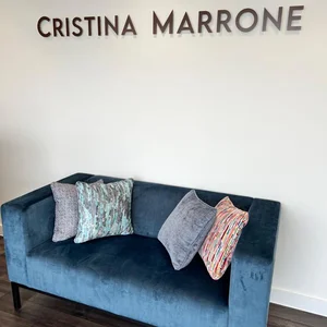
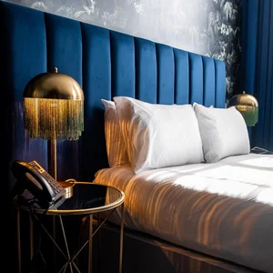
Dulux: An indigo blue-inspired palette.
Dulux has embraced a more versatile approach this year by selecting a family of indigo blues rather than a single standout shade. They delve into colour psychology, highlighting the sense of both fluidity and stability in the shades.
For us, the Ponte Vecchio collection captures the essence of this colour palette. Ponte an opulent, shimmering chenille and Vecchio, richly woven with a tactile finish, offer a range of deep indigos that can be paired with striking golds or subtle champagnes and powder puff pinks.
Pintrest: Pallette
In contrast, Pinterest opts for a palette as its annual colour drop. Essentially, it’s a collection of the hues that they feel will shape creativity as the year unfolds. Each a stand-alone shade, the team uses human behaviour signals with visual search technology and then curates the final collection.
According to Pinterest, the five results are expected to define the shades of 2026 and so can be a potential indicator of what the design landscape could look like. This year the shades are:
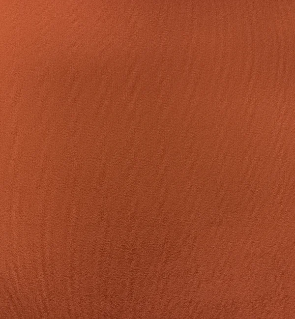
Persimmon
Cool blue
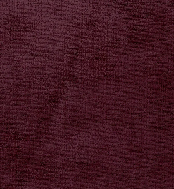
Plum Noir
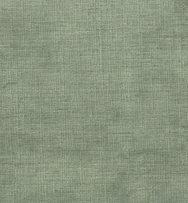
Jade
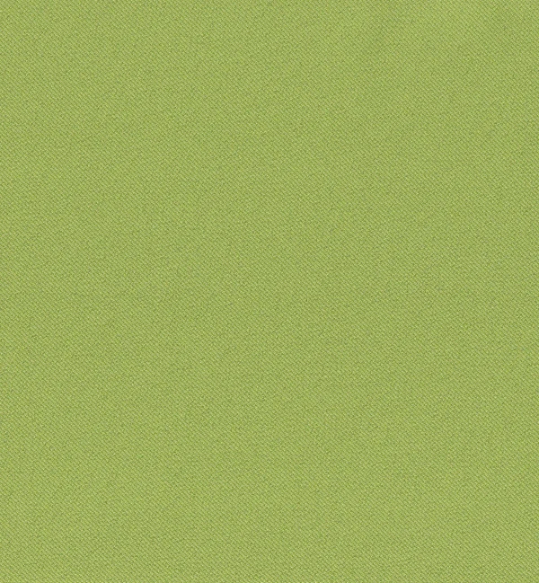
Wasabi
With such a broad palette, the colour combination possibilities are endless. Rather than unpacking each shade individually, we’ve turned to our own fabric below to help you visualise these shades in the real-world. Enjoy exploring.
- James LeVoir, Managing Director
View Swatches